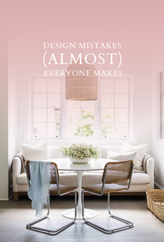
After over ten years in the interior design industry, and two on my own, I feel confident enough to make such a bold declaration. At this point in my career I’ve walked through more client’s homes than I can count, and without fail at least one of these design-faux-pas’ is always present. If you find that, despite your best efforts, your room just doesn’t feel quite right, take a good look at this list. Chances are it’s simply in need of a tweak or two that will instantly make everything fall into place. Following are a few design mistakes that (almost) everyone makes.
No Game Plan In Place
Client’s are always (always) taken aback when I lay out a timeline. It really does vary from project to project, but I’ve yet to complete even a small living room in under four months. The truth is that good things take time. And laying that foundation with a proper plan in place is a must. A must! If you aren’t working with a designer who will handle the planning and scheming legwork on your behalf, I strongly encourage you to measure your space to the nearest 1/8″, draw it up on graph paper to scale, and come up with a solid furniture plan. Once your furniture plan is laid out, you then want to unearth your style. Whether it’s flipping through Pinterest, or digging through magazines, simply pull photos that make your heart sing. Once you have a solid stack of pics in place, you should start seeing a trend – it could be mixed metals, it could be all things light and airy, either way there is almost always some co-relation between each shot.
At that point, armed with a clear idea of the aesthetic you’re drawn to and exactly what items (and what scale) you need to fill your space, you can then start picking your furniture. Do not purchase a single piece without going through the design process. I can’t stress this enough. There’s nothing worse than buyers remorse when you realize that the fabulous chair you bought on an impulse simply doesn’t work in your home.
Art Hung Too High
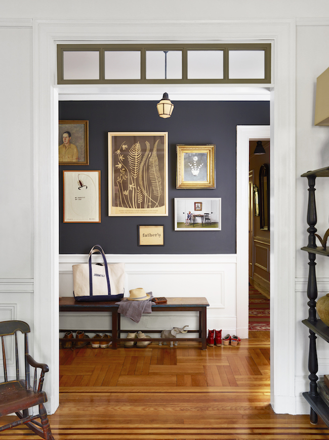
This is always a favourite design-faux-pas of mine. I see it time and time again – and I’m almost tempted to walk around with a hammer and nails so that I can course correct as I go. There’s nothing more unsettling than seeing art hung to high – it instantly makes a space feel askew. A good rule of thumb? Art should be hung 5′ from the finished floor to the centre of the piece. The same rule applies if you’re hanging a gallery wall – find the centre point of your entire gallery, and ensure it’s hung at the 5′ mark.
A Too-Small-Rug
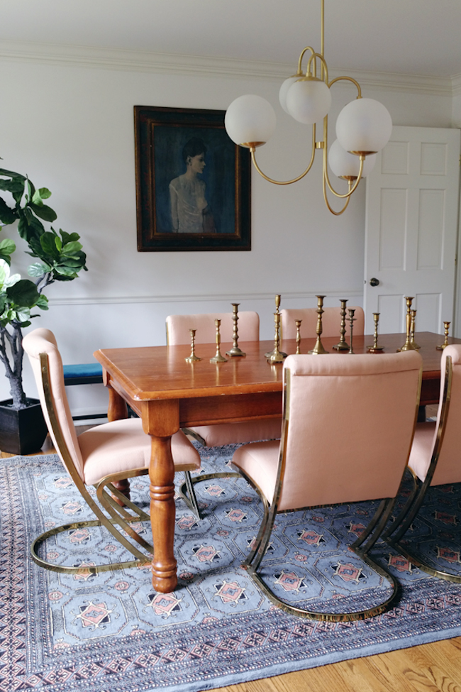
In my humble opinion, a rug is an essential part of any design plan. They’re used to define a space in an open floor plan, to add those layers that are essential in any good design, plus they absorb sound (so that you don’t have that awkward new-home-echo that I’m currently experiencing. The worst!) and add an instant cozy factor. The reality is that most rugs cost a pretty penny, and I totally get that it’s tempting to size down to cut costs. But please, don’t do it! If you are of the variety that wants a beautiful, Pinterest worthy, home, ensure your rug is the proper size. A good rule of thumb to follow: either all of the legs of all of your furniture pieces should be on the rug (so that the rug acts as an island of sorts, holding down the fort). Alternatively, ensure that all of the front legs of all of your furniture pieces are placed squarely on said rug.
Lacking in Character
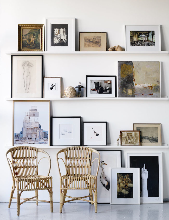
I firmly believe that every space should have a little moment of unexpected. A moment of weird, if you will, to keep people on their toes, and add another layer of interest. It could be an unexpected family momento framed on the wall, or an odd sculpture that speaks to you on the bookshelf. It doesn’t have to be much, but it should be interesting and tell its own story.
Not Paying Attention To Detail
Lastly, and I can’t stress this one enough, pay attention to detail. Those little details matter – together they add up to the sum of your space. Toss that cheap builder basic lighting, replace those yellowed electrical outlets, style your coffee table (even if it’s just stacks of books in varying heights), add greenery, hide unsightly cords to the best of your ability. The little things go a very long way.
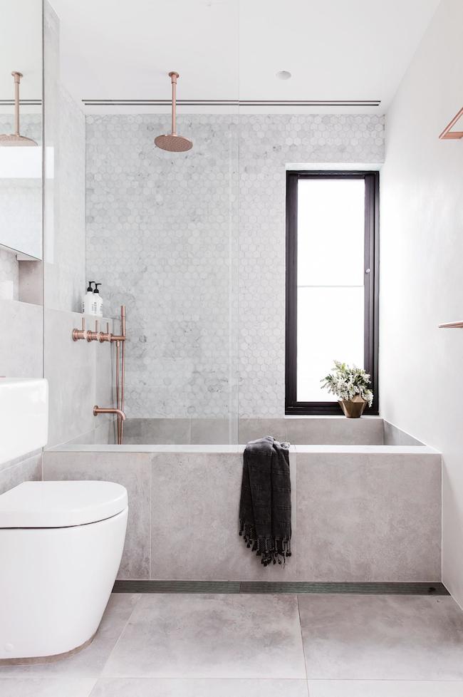
![]() Breakfast Nook: Domino | Elegant Bedroom: Laurie’s Home Furnishing | Gallery Wall: Country Living | Dining Room: House of Hipsters | Leaning Art: Roomly | Grey Washroom: Maree Homer
Breakfast Nook: Domino | Elegant Bedroom: Laurie’s Home Furnishing | Gallery Wall: Country Living | Dining Room: House of Hipsters | Leaning Art: Roomly | Grey Washroom: Maree Homer
filed in /


[…] Source: jacquelynclark.com […]
Great tips! I do have to disagree on the 5′ for art, though. That’s fine if the people living there are short (5’8 or under) but the tall people in the world don’t like looking down at their art. ;-) For myself and my hubby, it’s best centered at 5 1/2 feet. It all just depends on the people who should be enjoying the art. Something at 5′ for us would be like a 5′ 6″ person looking down at something centered at 4 1/2 feet, which is obviously silly.
Great tips!! You are right the details do matter and I’m always finding ways to add just a little more personality to our home. Thanks for your blog and it’s inspiration.
Thanks Sarah!
[…] Design mistakes almost everyone makes… […]
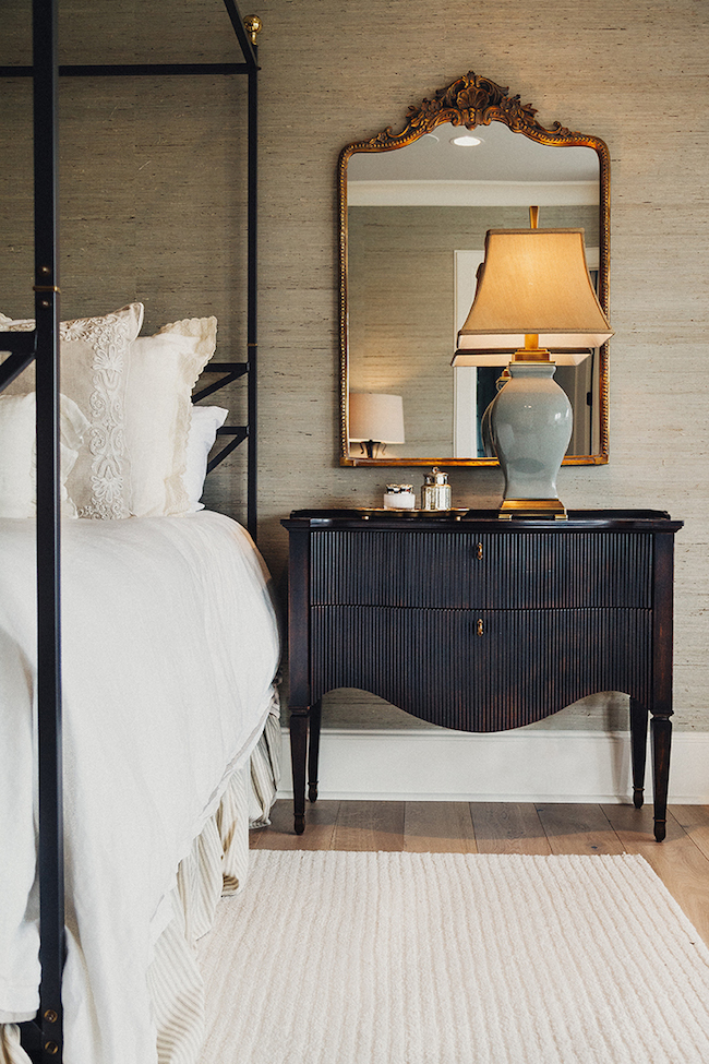
[…] nubby grasscloth is just so stunning! Source here This Lotus wallpaper by Farrow and Ball is so stunning in this foyer! Source here I made the bold […]