 SHOP THE LOOK:
If you picked up the January 2017 issue of Style at Home, you may have noticed a familiar face listed amongst its pages. And if you didn’t have a chance to grab it before it disappeared, you’re welcome to see the whole thing here. I’ve known since June that my #LLProjectImpressed project was going to be featured, but I wasn’t anticipating that it’d be such a big spread. I basically broke down in happy tears when the copy landed on my doorstep. To say I’m grateful would be a massive understatement. And, complete with photos from Stacey Brandford I’m so thrilled to share the whole project (before & afters, too!), below…
I know I wax poetic about my clients each time I do a client reveal, but you guys – I’ve hit the client jackpot again and again and this one is of no exception. Lynne, owner of the fabulous Impressed App, reached out to me about a month before I started my own business, letting me know she had been following my blog and Instagram account, and her and her husband were interested in some interior design services for their Toronto-based home. I hadn’t even announced that I was heading out on my own at that point, but the stars aligned, everything fell into place, and I quickly landed my very first client (making the transition from employee to employer, infinitely easier).
When I first walked through their home, I was completely taken aback. Located smack in the middle of the city, I wasn’t anticipating this sprawling space, complete with a two story bedroom with vaulted wood ceilings. The bones were absolutely incredible – jaw-dropping, even. And while Lynne and Hamid recognized the gem they had the pleasure to call their own, the home was long and skinny, made for awkward furniture placement, and simply didn’t feel like “them”. The soaring ceilings, red brick walls, exposed wood structure, and wrought iron details were stunning, but it made for a dark, almost cavernous space, with yellowed oak floors, bathrooms that had seen better days, and more worn-out slate tile than I can shake a fist at.

While it was important for us to not fight the industrial bones of the existing home, we knew we wanted to instill a fresher, more coastal vibe. But it needed to be implemented with a cautious hand. We ended up playing up the contrast between the two vibes, which made for a wonderful dichotomy.
We quickly got to work sanding (and bleaching) the existing floors throughout, refacing the worn kitchen cabinets, replacing track lighting with strategically placed pot lights, replacing all of the doors with double paneled ones painted a rich Onyx hue, giving every surface a lick of bright white paint, and gutting all three bathrooms so that we could start anew.
We made sure to leave some of the existing wooden support beams, as I always like to infuse a hint of wood for warmth and texture. The existing wrought iron staircase was left as is, and we kept the red brick. It was in such great shape, and added instant depth and interest – it would have been a shame to cover it up entirely. Aside from that, virtually no other surface in this 3,000 square foot home was left untouched.
The results: a series of calm, serene, spaces filled to the brim with life, love, and a ton of character. It was a true honour to have had my hand in this home’s design, and I only hope that it acts as a wonderful backdrop for many of this sweet family’s memories going forward. And if the whole before/after thing interests you, I’ve shared a bunch below. Enjoy!
THE FAMILY ROOM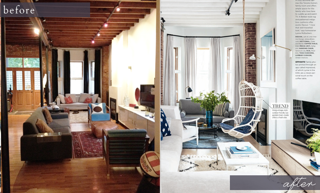
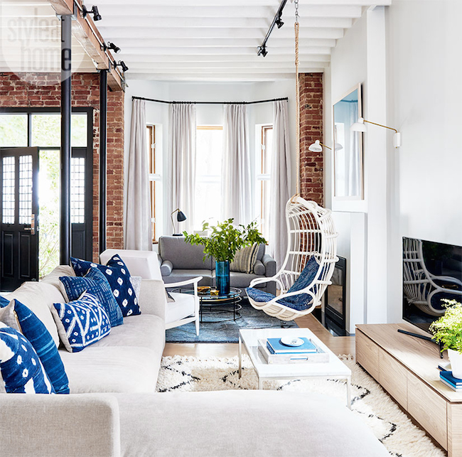
A painted ceiling, stained floors, and a new furniture layout instantly made this room feel fresh and new, while the swing (hung from the support beam above) ensures the space feels playful, family-friendly, and inviting.
THE FOYER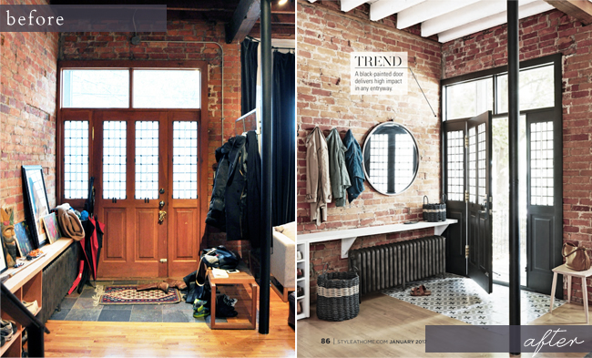
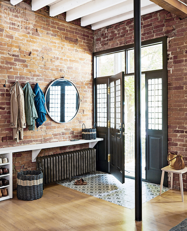
A new encaustic tiled floor, a painted door, and a custom designed storage system makes a great impact (that marries form and function) as soon as you enter their home.
THE LIVING ROOM
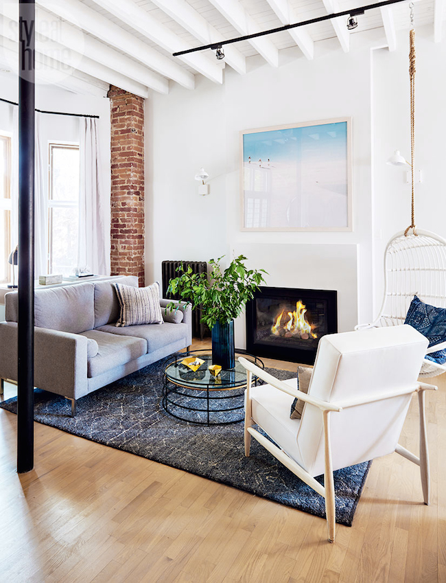
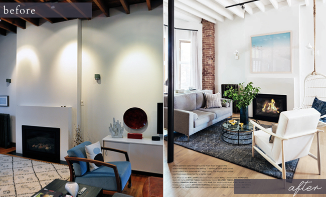 This family spends a lot of time reading and playing together, and craved a space in front of the fire that allowed them to do just that. The swing can rotate from family room to living room, connecting the two, and making great use of the long and would-be awkward floor plate.
THE KITCHEN & DINING ROOM
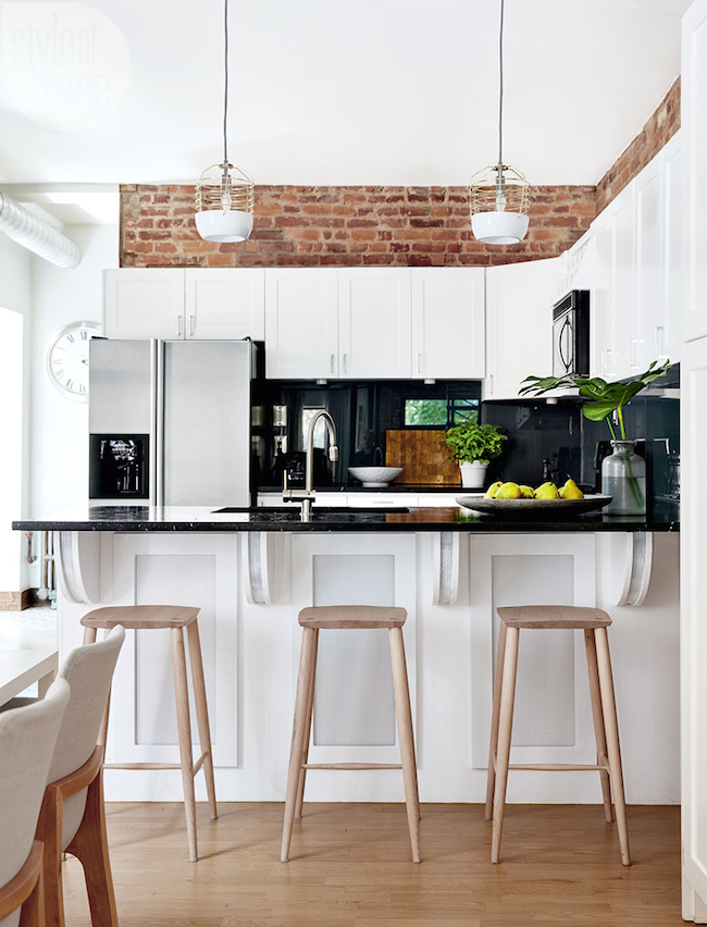
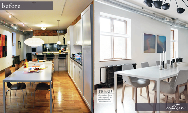 The existing kitchen had been painted a few years prior, but was begining to warp and peel – it had seen better days. Not up for a full kitchen gut, we opted to simply replace all of the cabinet fronts and added new hardware. It was a fraction of the price of a kitchen reno, but made a huge impact once all was said and done. Some new lighting throughout, some art, and some more comfortable dining chairs, instantly transformed the rest.
THE MASTER BATH
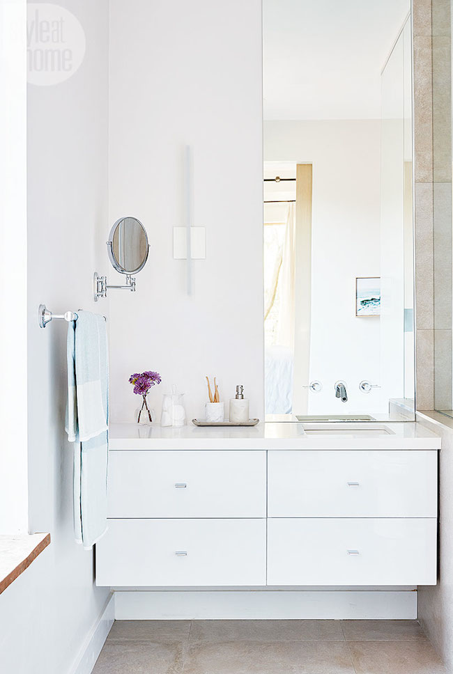
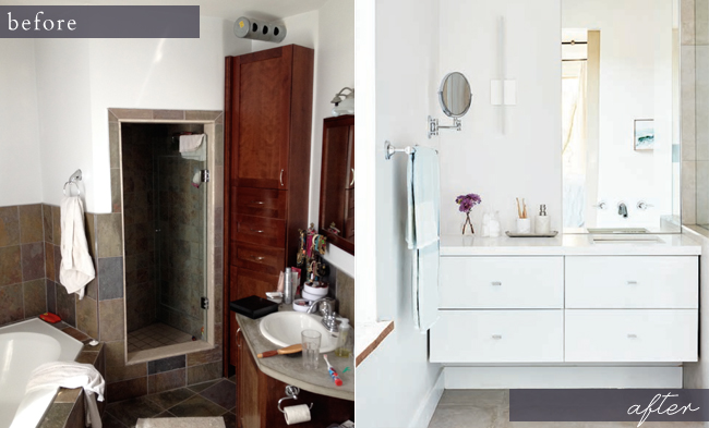
I wish I had more photos of this space that I could share – but trust me when I say that the transformation was night and day. The existing master bath had a very odd layout, with a corner tub, a semi-half-moon vanity, and teeny tiny shower. The layout in general was slightly awkward, complete with multiple angled walls, and everything simply needed to be gutted so we could start fresh. We ended up putting a deep soaker tub IN the shower (not pictured), and enclosed the whole thing in glass. Not only did it save space, but it made for a uniquely refreshing approach to the bathroom in general. Now, the entire room feels fresh, serene and spa-like. In other words: bathroom nirvana.
THE MASTER BEDROOM
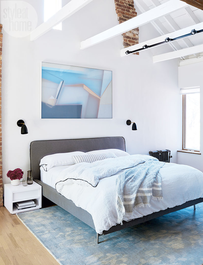
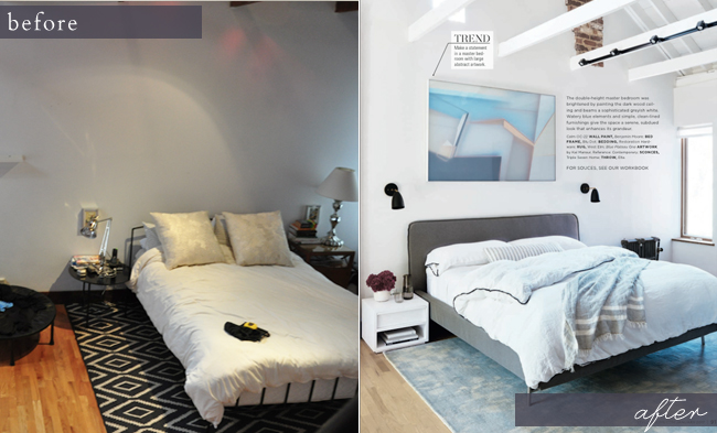
Like the vast majority of master bedrooms out there, this one started off as an after-thought. Nine out of ten times, the master bedroom is the last that gets tended to. Given that it’s where you spend a good chunk of your time, I’m of the firm belief that it’s an imperative space to design properly. We traded their existing queen bed, for a simple but sumptuous king (which was a much better fit, scale-wise, in this expansive two-storey space). Much like the rest of their home, we opted to keep the furnishings simple, but elegant and timeless. Quality over quantity was the name of the game throughout.
THE MASTER SITTING ROOM
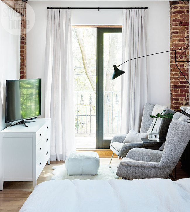
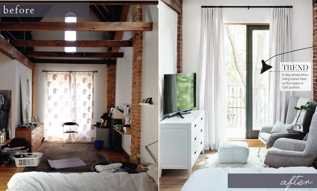
Both of my clients own, and run, their own separate business, which ultimately means that work often needs to come home with them. This little nook in their master was originally set up as an office, but they both found that they preferred to curl up on the couch with their laptops. With that in mind, we decided to switch gears and turn this space into a sitting room, complete with two (mobile) computer tables, and a new TV, to act as a casual “office” when needed.
![]() Interor Design: Myself | Client: Owner of Impressed App | Contractor: True Contractors | Photographer: Stacey Brandford | Featured in: Style at Home
Interor Design: Myself | Client: Owner of Impressed App | Contractor: True Contractors | Photographer: Stacey Brandford | Featured in: Style at Home
LIVING ROOM:
Wall paint: Benjamin Moore – OC-64 Pure White | Flooring Throughout: existing, sanded & stained | Artwork: Julia Christe, custom framed at Dimensions Gallery | Sconces: Lambert et Fils | Sofa: Custom, L’Atelier Home | Arm chair: South Hill Home | Hanging chair: Serena & Lily | Coffee table: Black Rooster | Rug: Elte | Toss cushion on sofa: Amber Interiors | Drapery: Threadcount Belgian Linen Fabric, Custom made @ Tonic Living
FAMILY ROOM:
Throw on sectional: Cambie | Tripod floor lamp:West Elm | TV console: Calligaris | Sectional: Crate & Barrel | Rug:West Elm | Coffee table: EQ3 | Drapery: custom | Throw Pillow: Amber Interiors, Custom
ENTRYWAY:
Entryway floor tile: Mettro Source | Door paint: Benjamin Moore – Onyx | Mirror: Elte Mkt | Console shelf: custom | Side table by door: Coolican & Co.
DINING AREA:
Wall paint: Benjamin Moore – OC-64 Pure White | Dining table: existing | Chairs: France & Son | Artwork: Kal Mansur, Gray Valkyrie 19 (2016), from Reference: Contemporary| Concrete Candlesticks: Easy Tiger | Black Candlesticks: CB2
KITCHEN:
Cabinetry Refacing: custom | Cabinetry paint: Benjamin Moore – Chantilly Lace | Pendant lights: Black Rooster | Stools: Coolican & Co. | Faucet: Existing | Appliances: Existing | Countertop: existing | Cabinetry hardware: Restoration Hardware | Large slate bowl: Artemano
BATHROOM
Vanity: Custom | Vanity countertop: Corian – Designer White | Wall paint: Benjamin Moore – Calm – oc-22 | Faucet: Kohler | Sconce: YLighting | Mirror: custom | Shower: custom | Shower & Floor tile: Stone Tile | Bathtub: Wet Style | Shower Faucets: Kohler
BEDROOM:
Wall paint: Benjamin Moore – Calm – oc-22 | Rug: West Elm | Bedframe: Bludot | Bedding: Restoration Hardware | Throw: Cambie | Sconces: Triple Seven Home | Nightstands:EQ3 |Artwork: Kal Mansur, Blue Plateau One (2016), from Reference: Contemporary | Throw Pillow: Amber Interiors, Custom
SITTING AREA in BEDROM:
Drapery: Threadcount Belgian Linen Fabric, Custom made @ Tonic Living | Armchairs: BoConcept | Articulating sconce: Design Within Reach | Rug:West Elm | Poof: existing | Dresser: Crate & Barrel
filed in /


Oh my that transformation is crazy! So beautiful!! Your taste is so lovely. I wish you lived in Austria so I could hire you to help with my home too. ;)
Thank you Andrea! It would be a DREAM to design a home in Australia. I’m always open to travel ;) Ha!
[…] post Client Reveal: #LLProjectImpressed appeared first on lark & […]
It’s crazy to think it’s the same house! Everything is beautiful x
Jessica — NinetyCo
Thank you so much Jessica!
Bright and welcoming. Wonderful job. Though I do like the original floors. I like the bleached version, too, but I’m a sucker for old wood floors.
They were in pretty bad shape in person. They definitely needed some love!
This home is stunning! You did an impeccable job – and what an amazing first client to have! Cheers to you!
Thank you so much Christy! I’m telling you: client jackpot over here. I’ve had nothing but wonderful people, and incredible projects, come my way <3
It’s wonderful!!
Thanks, Mom :)
This home has been given a wonderful makeover – your attention to detail is amazing. Your clients must be so happy!
Thank you, Susan!
We love it Jacquelyn! You were a dream designer too :)
XOX!
Well done, very inspiring–congratulations!
Whoa! The place looks incredibly amazing!! Congrats on your feature as well <3
[…] an Instagrammer (This Renegade Love) 5. 3 Ways to Remain Hopeful (Blare June) 6. Obsessed with this Toronto home would be an understatement (Lark & Linen) 7. The ultimate Valentine’s Day gift […]
This is such a beautiful transformation. I love seeing the transformation between the before and after photos.
Gorgeous! I love the mix of black, white, brick and wood. What a dream home!
xo Jules
[…] awesome interior design project from Jacquelyn Clark – she’s so […]
Very lovely.
[…] links: + Jacquelyn’s client reveal is stunning! + How millennials are changing the face of parenthood + the cutest sugar cookies that […]