 SHOP THE POST:
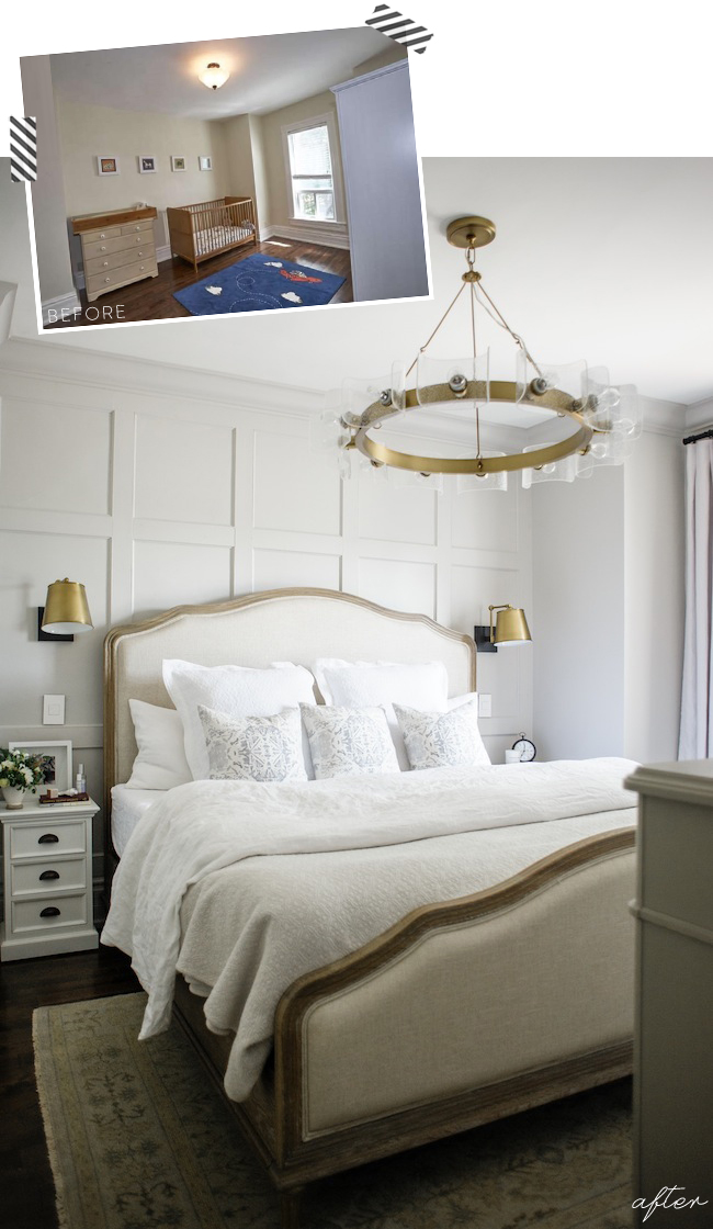
After what feels like a lifetime of waiting, I’m beyond thrilled to finally share our master bedroom reveal, shot by my lovely friend Heidi. Unfortunately, we were hit with a number of unforeseen delays, both during construction as well as on the furniture availability front, but alas we are officially done, sleeping soundly, and it was all more than worth the wait – if I do say so myself.
If you’ve been around here for a while now, you may remember the bedroom design plans I posted back in February of this year (here), and I cannot express how wonderful it is to finally see that vision come to fruition. I’ve spent over a decade in the interior design industry now, and this never gets old, I swear…
But let’s back up for a second. For those of you who are new around here, we purchased our home late summer of 2016 (which you can read about here). It’s an old Victorian, built in 1898, and while it boasts incredible original bones, and was well loved over the years, it definitely needed a little designer action to really make it sing. If you’d like to see it all before we even moved in, you can check out my video tour here so you can see what I mean. We started by gutting the formerly heinous bathroom before we even moved in (which you can check out here), and have spent the last year or so slowly but surely designed every last space to suit our exact needs and aesthetic preferences.
Once the bathroom was complete, we quickly got to work on the next order of business: building a master closet. Much like any old Victorian, closets in our home are in very short supply. In fact, our master (which was the previous owners’ nursery) didn’t even have a closet – it was filled with a number of stand alone wardrobes which didn’t do much other than enclosing the space. In order to rectify this, we knocked down the wall between our master and our office. We then rebuilt it 18″ or so into the office, shrinking the office a little, but making our bedroom just large enough to accommodate a new wall to wall closet, without taking over too much of the already tiny room. This alone was a game changer, and has of course vastly improved the function of our entire home.
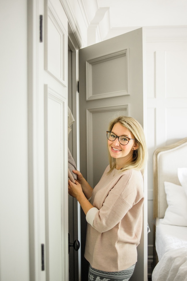
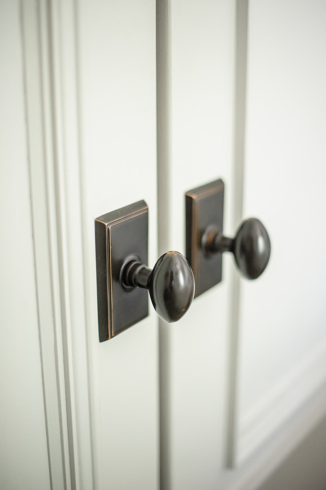
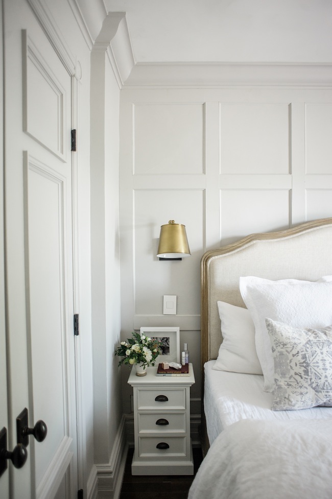
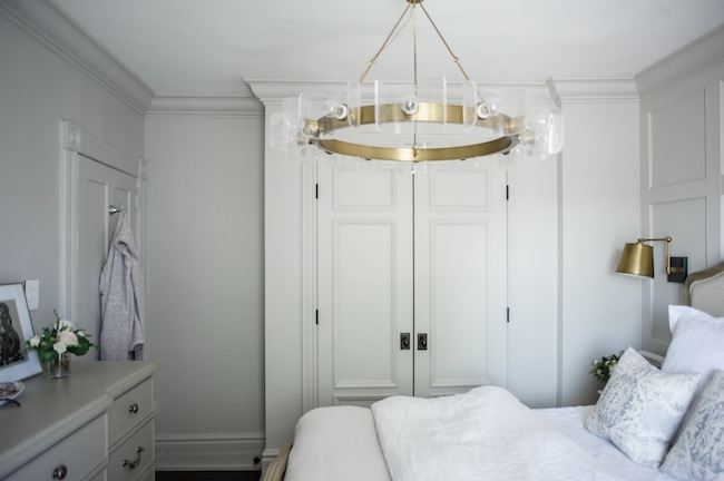
While our home is not large by any stretch of the imagination, I like to tell myself that it makes up for its size in style and character. And we made sure to up the ante in that regard while we were constructing the aforementioned closet. Adding wall to wall panelling in a simple grid configuration behind our bed instantly added a design layer, and a focal point, that you just can’t beat. Double, extra tall, closet doors with the prettiest door detail set the stage. And we topped it all off with glorious 6″ thick crown moulding throughout. I also worked closely with Metrie to match the new closet door casings with the existing ones, which is one of those details that you really don’t notice unless it’s done wrong. Read: it makes a big difference.
We then painted out every last inch – doors, mouldings, crown and beyond in Farrow & Ball‘s Cornforth White, which is the more glorious shade of grey that somehow feels light and bright, yet rich and moody all in the same breath. It is absolutely my newest favourite paint colour and I’m confident you’ll see it around here much more frequently in the years to come.
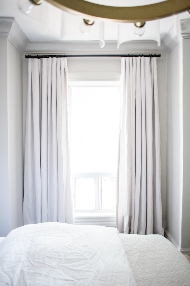
Opposite the new closet wall, you’ll find a single tall and narrow window that we dressed up in custom curtains. The curtains themselves are a beautiful Belgian linen in a heather grey, hung high and wide to make our tiny window look as big as physically possible. The monochromatic palette throughout allows the space to feel quiet, yet sophisticated all at once.
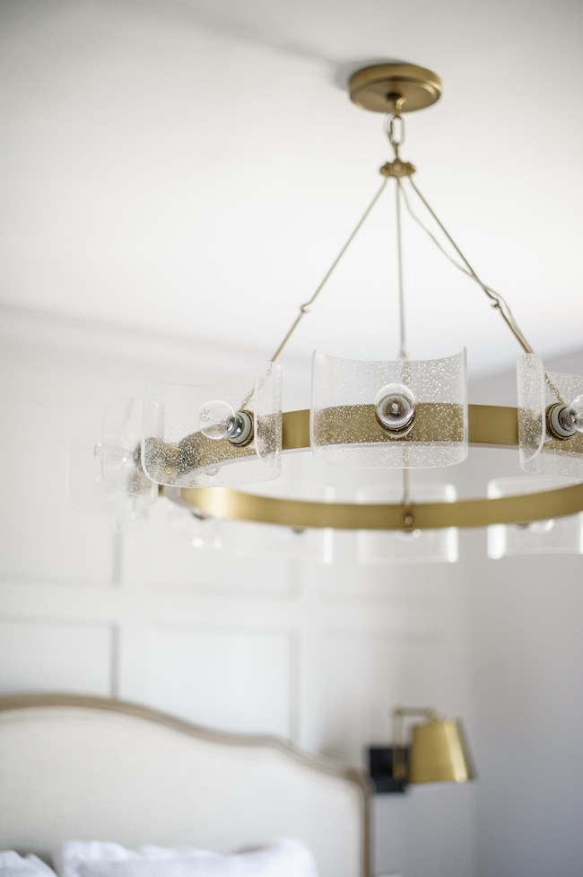
I’ve gone on a lot of lighting schpeels over the years, so I won’t get into too many details but know that I fully believe that lighting makes or breaks a space. It’s something that we have most certainly not ignored in our home – really good light fixtures simply make all the difference in the world.
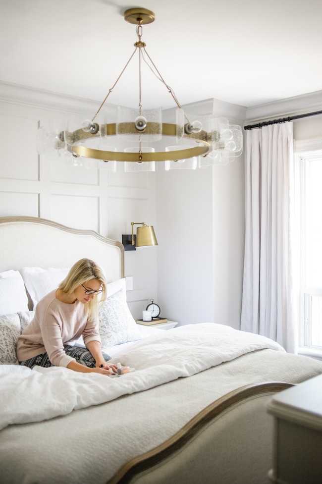
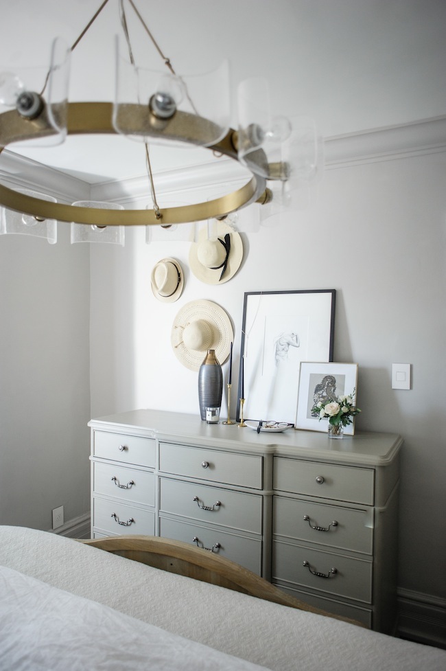
And while the rest of our room isn’t short on character, we did purposefully keep everything soft and understated to act as a respite from our hectic schedules. That said, while the first layer of softness is wonderful, I knew we’d need something to make a bit of a statement. We opted for an oversized chandelier above our bed that delivers big time on the drama front. I will admit that this chandelier, in particular, gives off way more light than we’ll ever need in this space. But we use the smallest wattage bulbs on the market, and put it on a dimmer so we have complete control over the mood and ambience. Game changer.
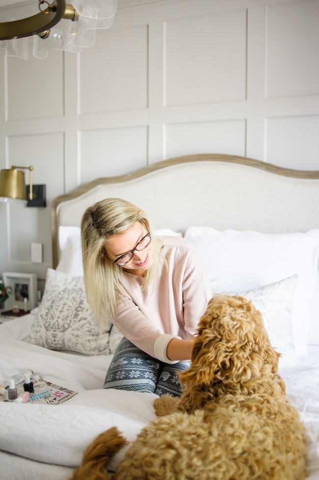

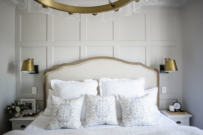
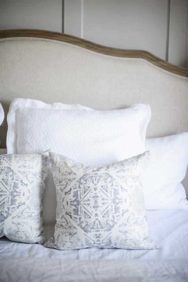
If there’s one thing that Justin and I both take very seriously it’s sleep. When we first started house hunting, especially in the crazy market that is Toronto, we knew we’d have to make a number of concessions on our first home purchase. But the one thing that we refused to budge on was our desire to upgrade to a king bed. Meaning, we needed to purchase a home with a large enough master bedroom to accommodate, and naturally brought a measuring tape with us to every showing, as you do when you’re normal functioning humans with a one track mind.
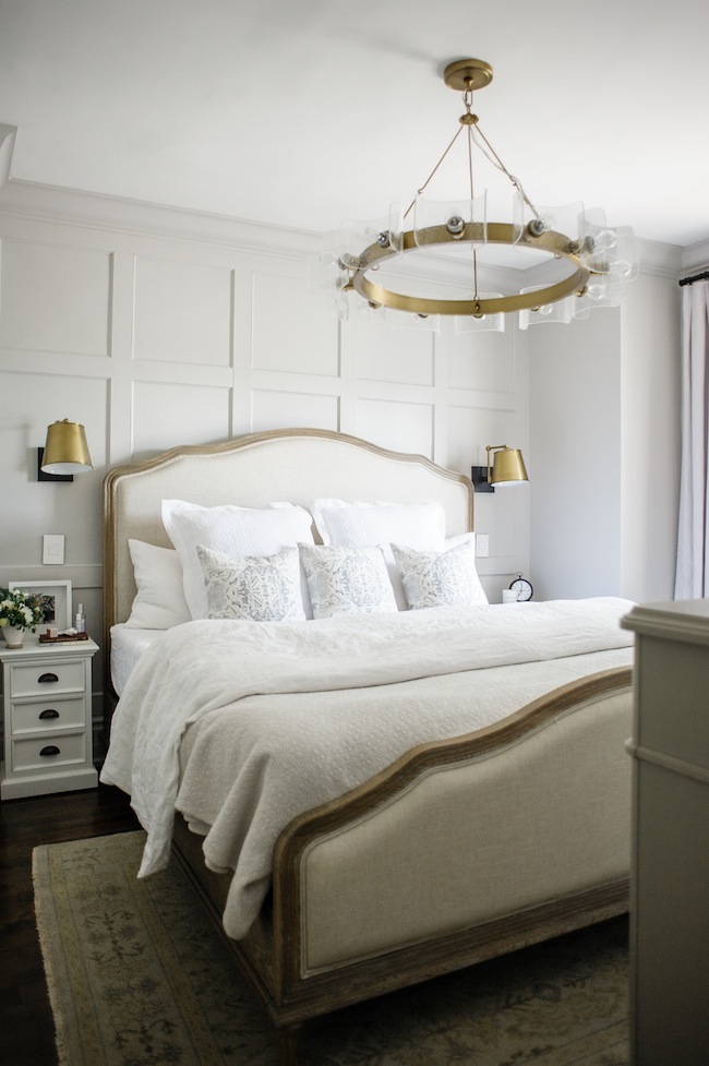
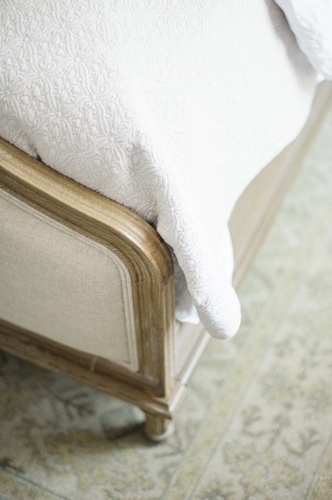
Now, I’ll be the first to admit that the size of our room really does call for a queen, but we went full tilt on all things king bed, and we have had zero regrets. I secretly love the fact that our bed essentially takes up the entire room – it’s oddly cosy, and makes for an incredible night’s sleep. We ended up getting the Hyphen mattress, which was essential as it came vacuum sealed in a box which allowed us to fit it up our narrow staircase. Admittedly, I was a little nervous at how comfortable it would be, but after sleeping on it for a few months now, and pleased to announce that it is just as lovely as our former traditional mattress.
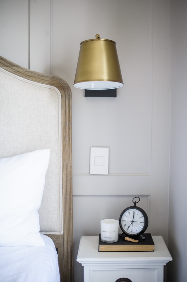
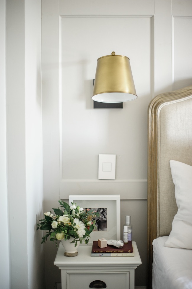
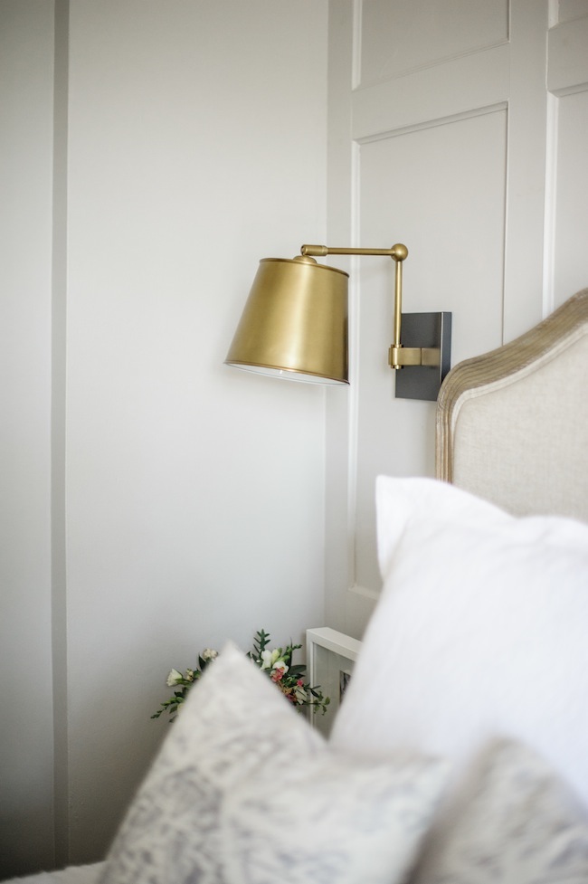
However, our ginormous bed and our tiny bedroom ultimately meant that we were left with very little space for nightstands. We ended up finding these little guys, which have a tiny footprint, but three drawers – which is perfect for tucking all of the unsightly things away. And because I knew we’d be left with very little counter space, we opted to install wall sconces on either side of the bed. Each sconce is separately switched, and said switch is located right next to the bed – which is perfect for late night reading. I don’t think I’d ever live without a soft tap light switch next to me again. Apart from our aforementioned bed upgrade, this little addition has become the ultimate luxury and has made all the difference in the world.
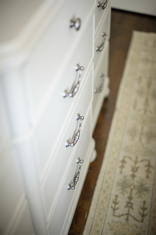
Opposite our bed, you’ll find the largest dresser I could get my hands on, that takes up as minimal of a footprint as possible. As mentioned, storage is at a premium around here, so not only have we purged virtually everything we own (which, in all honesty, deserves it’s own separate post), but we also made sure to include as much drawer storage as physically possible. This dresser is like the Mary Poppins’ purse of dressers. It holds an incredible amount, and looks pretty darn good while doing so.
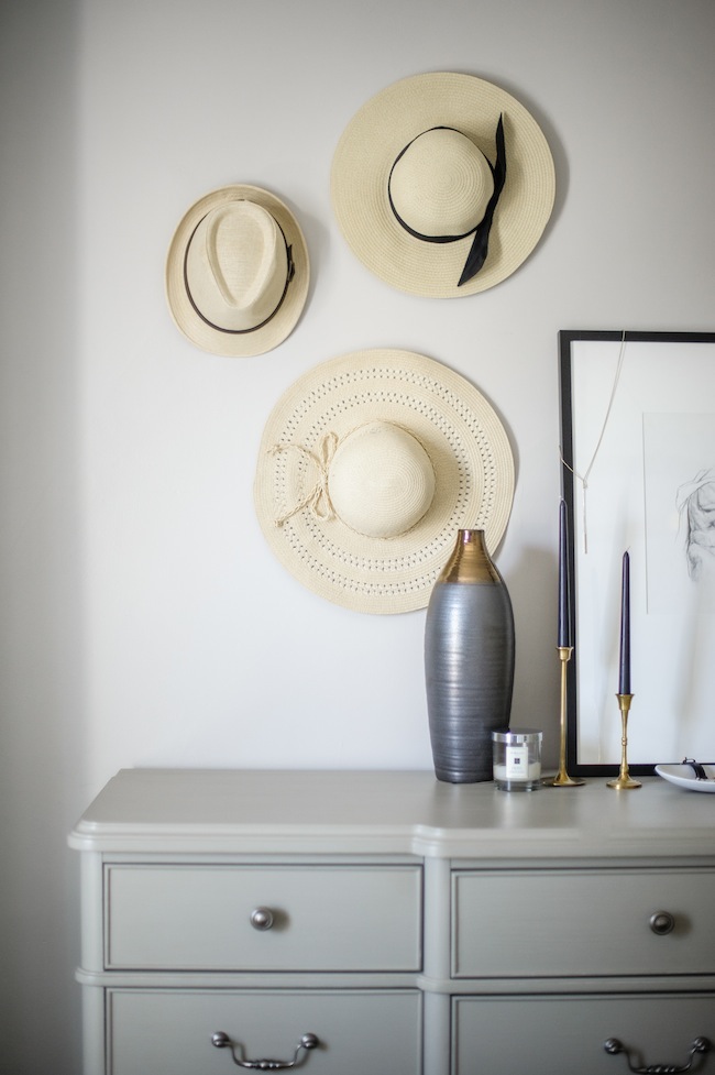
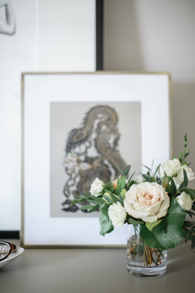
Bonus: it also acts as a pretty spot to hold some of my very favourite possessions. My grandmother’s jewellery, vintage candlesticks, and some of my favourite original art (a piece from my friend Jess drew, which we recently had custom framed here, and a laser cut out we purchased in Thailand) now sit proudly on display.
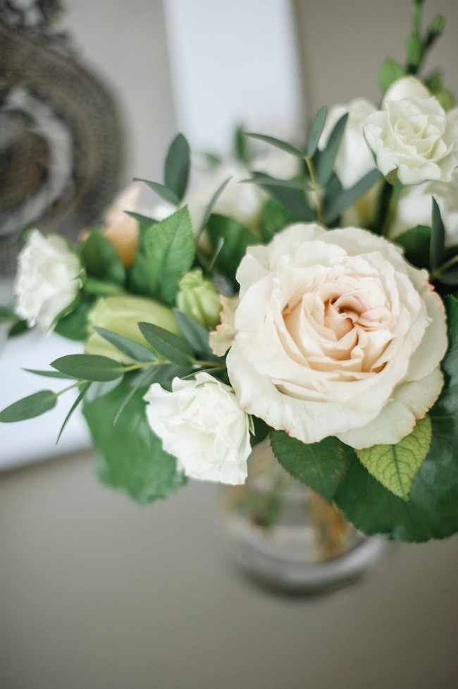
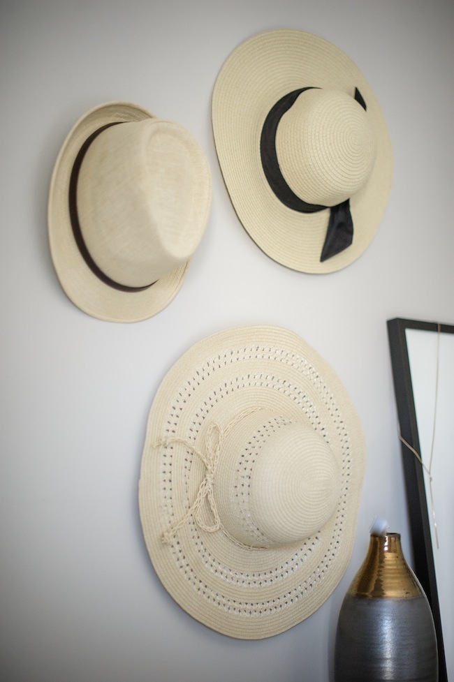
Admittedly, I added the hat wall for the shoot purposes only, but have ultimately decided to keep it. Not only does it look adorable, but it’s also proven to be a surprisingly great way to store our hats (hi, storage!) that seem to always get smushed otherwise. I just love when form meets function.
There you have it! Our master bedroom in all of its beautiful glory. I’ve shared every last source below. And wanted to link to the other room reveals we’ve done so far, if this is your jam:
Our Bathroom Reveal
Our Office Reveal
Our Living Room Reveal
Our Kitchen Reveal
As a note: you can also follow along with progress on our home front on instagram using the hashtag #ProjectLarkandLinen. Alternatively, you can check out all of my own home tour & progress posts here.
SOURCES:
![[break]](https://jacquelynclark.com/wp-content/uploads/2013/05/line.jpg)
Photography: Heidi Lau | Flowers: Threads & Blooms
Design: Myself (Lark & Linen)
I’m WEARING:
Top: H&M | Robe: Nordstrom
Thermal Leggings: Old (Similar Here and Here) | Glasses: Dior
FURNITURE:
Mattress: Hyphen | Bed: Wayfair | Area Rug: Amber Interiors
Nightstands: Houzz | Wall Sconces: Arteriors
Chandelier: Arteriors | Dresser: One Kings Lane
Curtain Fabric: Threadcount Inc.
Curtain Labour & Hardware: Tonic Living
ART & ACCESSORIES:
Figure Drawing Art: Jess Blazejewski | Custom Framing: On the Wall Framing
Sandalwood Candle: Etsy | Lime & Basil Candle: Jo Malone
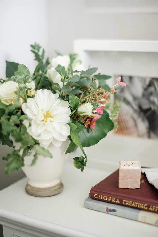
Vintage Candlesticks: Etsy | Engagement Ring Box: The Mrs. Box
Sheets, Pillow Cases & Duvet Cover: Cultiver
Quilt: Annie Selkie | Toss Cushions: Savannah Hayes
CONSTRUCTION:
Crown Moulding: Metrie | Wall Panelling: Metrie
Wall Colour: Farrow & Ball – Cornforth White | Closet Doors: Metrie
Closet Hardware: Upper Canada Hardware | Light Switches: Legrand
Wall Outlets: Legrand
filed in /





Absolutely gorgeous! And I love that you went with the big bed.
No regrets!
You never disappoint – like never. It’s gorgeous!!
Thank you, sweet friend <3
You didn’t such an amazing job Jacquelyn! It looks so stylish AND so cozy!
THAT’S MY SPECIALTY! Or at least that’s what I like to THINK is my specialty haha
It’s just gorgeous!! Love, love!!! xoxo
It looks fantastic! Amazing job!
Perfection! (not that I’m surprised!) What a lovely space!!
Your bedroom is GORGEOUS! Love the reveal – and that light fixture! What a beauty.
Thanks, Gabi!
So happy to finally see the reveal. It looks beautiful and peaceful. I love to read about all the details.
Was that chandelier really $2400? I only wish I could renovate like that!
It was! It is a literal work of art though.
I just love everything,what a gorgeous inspiration for my next bedroom
Thank you so much,
So glad I could inspire <3 Literally my favourite thing to hear - ever
I love what you have done to your bedroom. I also love to read about the details. Makes me want to redo my room now! I love the 3 throw pillows Can you tell me the measurements of those gray and white throw pillows on your bed? Thank you
Hey Elaine! They’re 22″ x 22″
it’s gorgeous! A little slice of heaven.
I think so :)
I’m in love! May I ask, what paint color did you use on the ceiling? Thanks!
The ceilings and trim are Benjamin Moore – Cloud White
Even though this is drop dead gorgeous, I enjoyed your 2014 post on your “condo makeover” a lot more. I think a lot more people can relate to a post where you showcase purchases from ordinary stores (Ikea, West Elm, etc…), Craigslist buys, “do it yourself” projects, things that everyday people who don’t have thousands and thousands of dollars to throw at renos and furniture can do say “you know what, I could do that”. It was the reason I ran into your website, became inspired and enjoyed it so much!
I appreciate that Kate, thank you. I will definitely keep that in mind! It’s a tough balance as I’m trying to brand myself as a luxury interior designer (which is where %99.9 of my income comes from), but definitely, don’t want my work to come off as ostentatious. It’s a fine line for sure.
So beautiful!! The Mine is linked to Lowe’s and I cannot find your bed frame. Can you provide a different link? I love it!! I have found others but I would really like to see the measurements and price of yours. Thanks for your help!!