If you’re new to my mom’s kitchen renovation series of posts, you might want to start here!
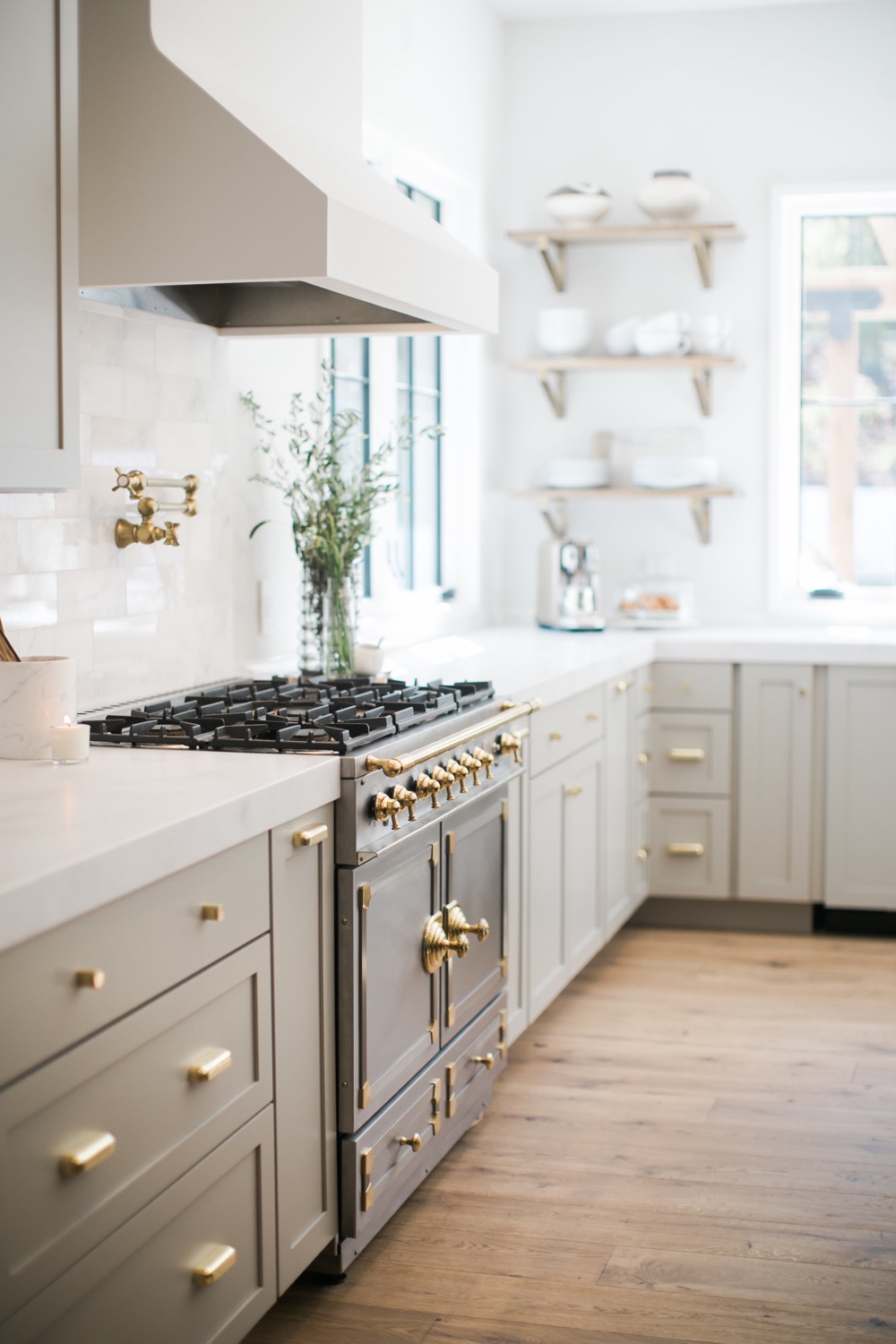
Photo: Cher House
Construction is officially well under way at my mom’s kitchen, and I’ve been sharing as many behind the scenes peeks as I can on Instagram Stories as we go (there’s a highlight called “Mom’s Kitchen” over there, if you’re curious to check it out!) It’s pretty messy and dusty around there lately and there isn’t a whole lot to see quite yet as plumbing, hvac, and electrical gets sorted out, but things are about to ramp up and there’s a whoooole lot of pretty coming our way! Before we get into the nitty gritty of the plans and details, however, I thought it’d be fun to take a look back at where it all began. (ps – you also might want to check out this post, which details all of the before photos & plans)
Before I start any project I always have my client fill out a needs assessment q&a. Essentially, it’s a questionnaire that details everything from longterm goals, to lifestyle preferences (ie: how they actually use the space), to family history (including any plans to expand said family in the future) to aesthetic predilections and beyond. And while it’s always so helpful, and gives me a much better idea of how to customize each individual space to suit their exact needs and desires, the thing I find most impactful is the portion wherein I have them pull a series of inspiration images and send them my way. It’s amazing how much you can get to know someone based off of that information.
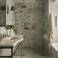
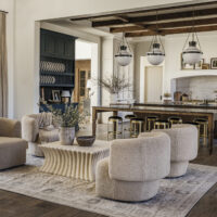
Once I’ve had a chance to go over absolutely everything in detail, I do the same. While things naturally ebb and flow as the design process does, the inspiration images I pull that best represent what I’m envisioning for that particular project always end up being the driving factor the whole way through. For my mom’s kitchen, I thought it’d be fun to share some of the original sources of inspiration we were working off of. Classic and timeless, with tons of neutral elements, were the name of our game, and I’m excited to show you how we’ve translated these inspiration photos into something tangible, designed specifically just for her. Here’s where it all began…
![[break]](https://jacquelynclark.com/wp-content/uploads/2013/05/line.jpg) OTHER POSTS FROM THIS SERIES
OTHER POSTS FROM THIS SERIES![[break]](https://jacquelynclark.com/wp-content/uploads/2013/05/line.jpg)
My Mom’s Kitchen: The Before Photos & Plans
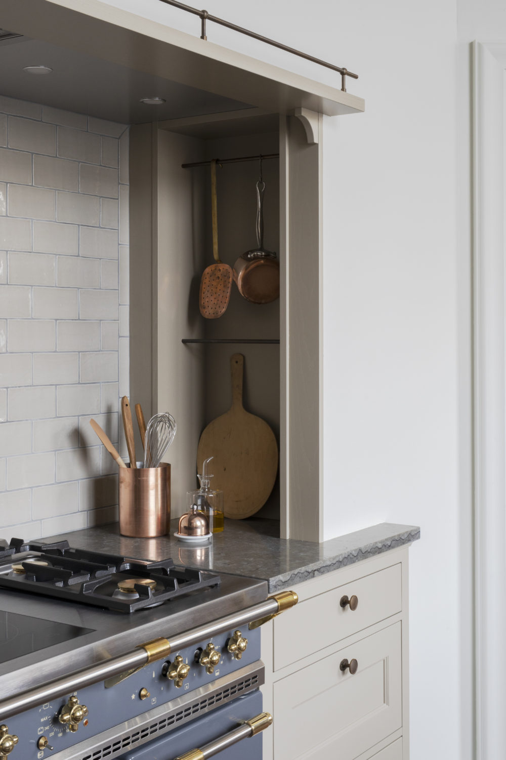 Photo: Kvänum via Remodelista
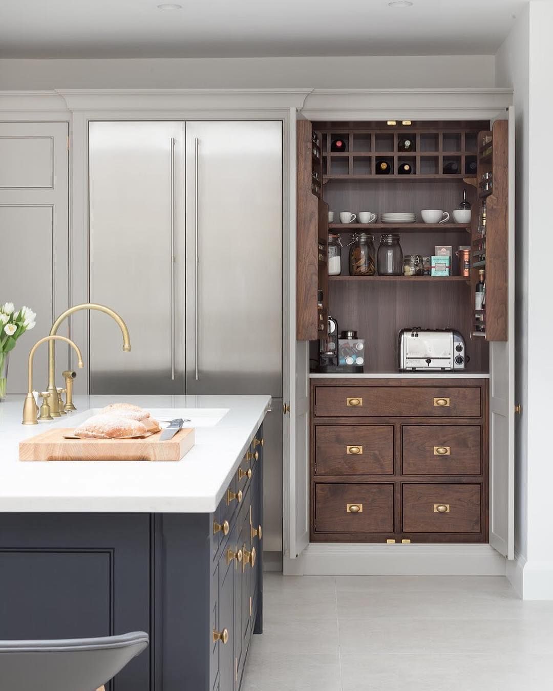 Photo: Paul Craig
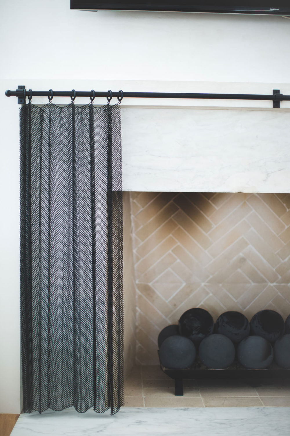 Photo: Ashley Gilbreath Interior Design
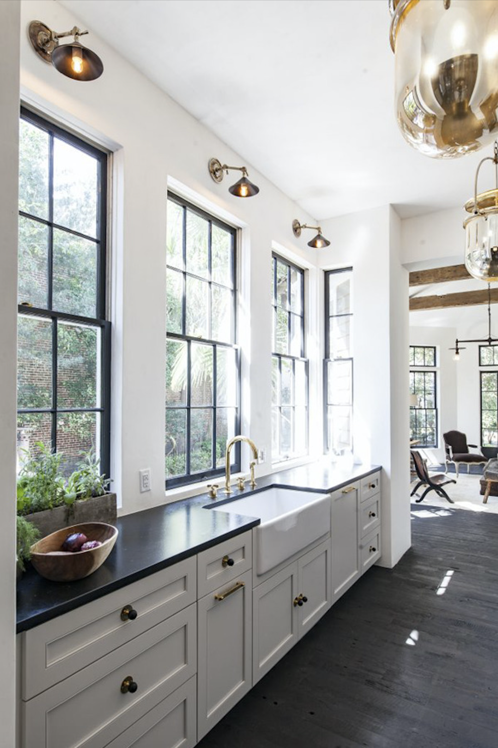 Photo: Jen Langston Interiors
![[break]](https://jacquelynclark.com/wp-content/uploads/2013/05/line.jpg) CHECK OUT OTHER CLIENT PROJECTS RIGHT HERE
CHECK OUT OTHER CLIENT PROJECTS RIGHT HERE![[break]](https://jacquelynclark.com/wp-content/uploads/2013/05/line.jpg)
filed in /

This is all very exciting!! xoxo
Isn’t it!? It’s coming together!!
Love! What is the color of the cabinets?
You’d have to reach out to the original designer of these spaces for that exact info, but we’re doing Benjamin Moore – Revere Pewter for my mom’s kitchen! It’s a stunning soft taupe-putty shade – such a classic
This is going to be so beautiful! Also, is there going to be a fireplace in the kitchen? So dreamy!! Can’t wait to see the final reveal :)
Yes ma’am!! You can see the original floor plan here: https://jacquelynclark.com/2020/01/17/new-project-alert-moms-kitchen/
And I’m sharing the new floor plan Monday! I’m pumped!
Brilliant Concept!! Keep up the Good Work!!
Thanks!!
I love your inspiration and plans for your mother’s kitchen. I’d love for you to check out my blog https://emilyreneecunningham.wixsite.com/emilyreneedesign where I’m documenting a house flip in North Carolina!