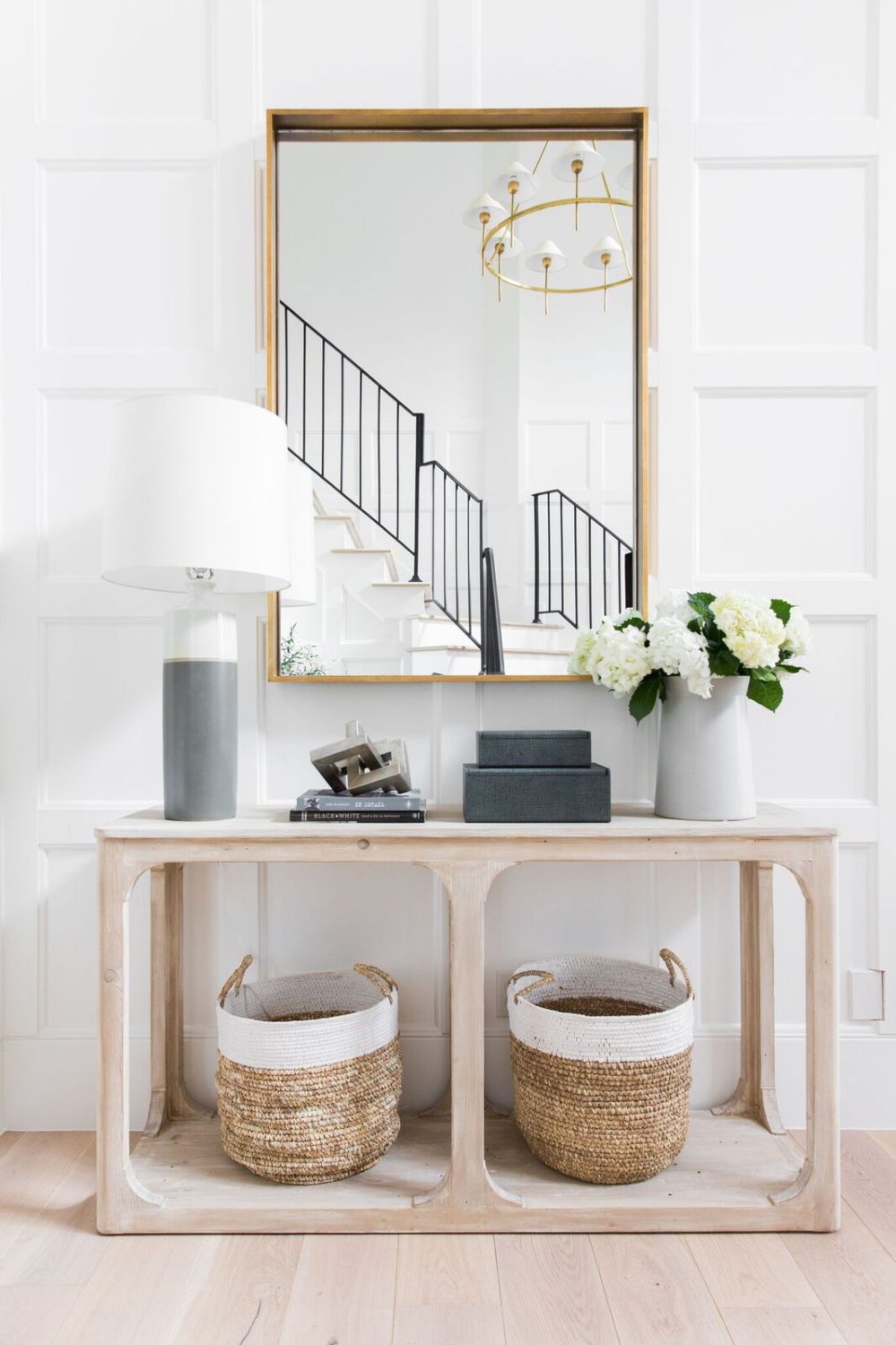
 Photo & Design: Studio McGee
SHOP THE POST:
First and foremost, I wanted to thank you for all of your love and kindness over my Project Columbine reveal (if you didn’t see it last week, definitely check it out here!) This year has consisted of quite a few amazing larger projects that have been killing me not to share (if you follow me on Instagram, however, I’ve recently started a story highlight for each individual project I’m currently working on where I share of the moment behind the scenes peeks, which has been really fun. I’m getting a ton of great feedback so far, so if you’re all interested I’ll likely keep it up!) At any rate, this is one of the projects in question. It’s one that I’m incredibly proud of, and it’s been so nice to finally unveil it all in all of it’s glory. And while there’s a chance I should just leave it at that and let it do it’s thing… I though it might be helpful over the next couple of weeks to take a look back at each separate room to see how they all came together.
Today we’re going to be looking at designing a foyer. Foyers are often a bit of an after thought, but they really are the hub of the home. The workhorses, if you will. Not only do they have to combine both form and function, but it’s also the very first room that anyone and everyone sees – from your in laws, to your best friends, to your postman, they set the stage for the rest of your home, and no matter the size, I take them just as seriously as any other room I design.
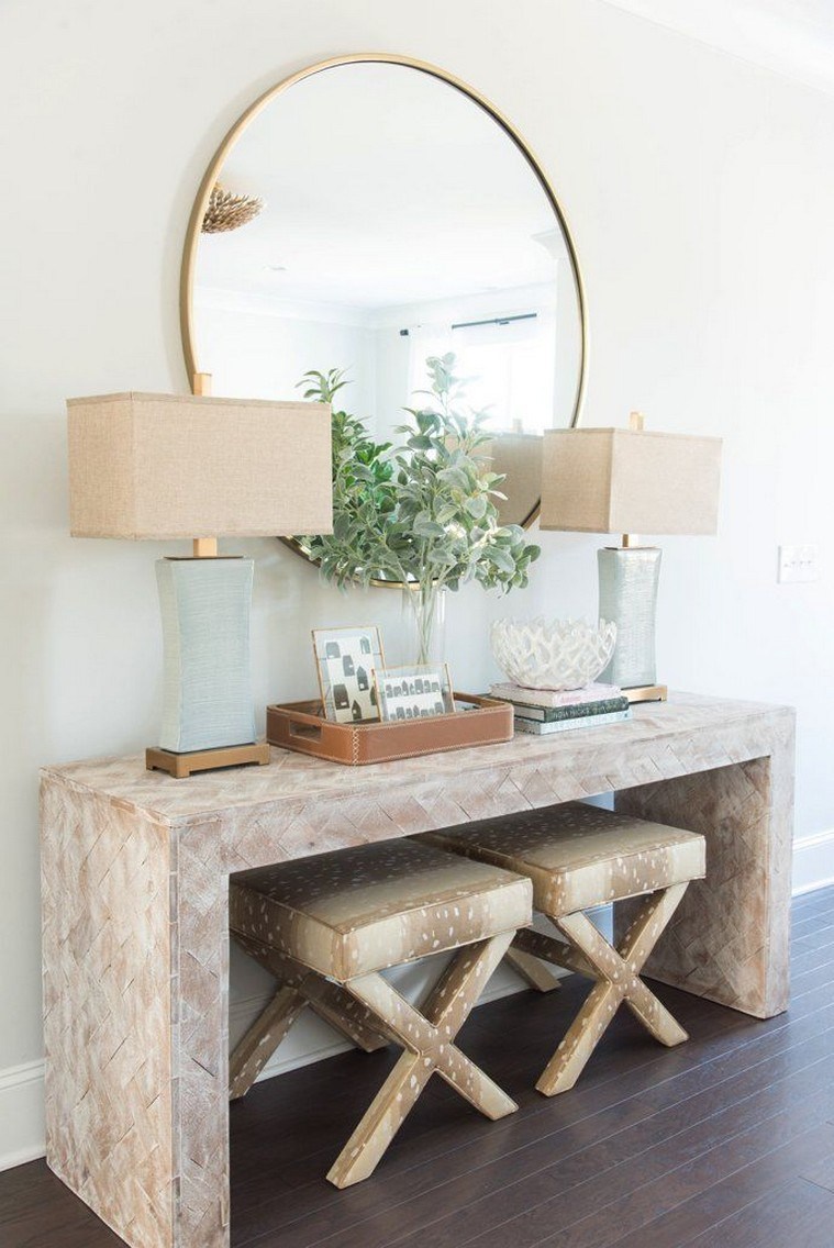
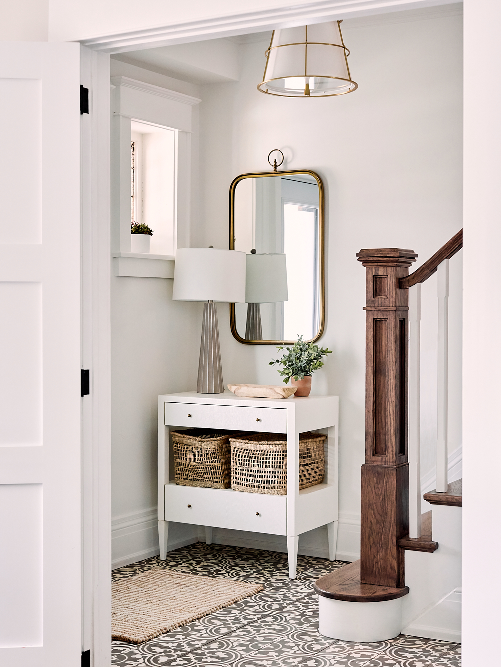
I don’t know about you, but I am so dang nosey and always love a peek at the process work when it comes to designs. For me, a project always starts on Pinterest. After conducting my preliminary interviews (I actually have a pretty comprehensive lifestyle and design q&a I send out to every new client), I take all of those notes and translate them into visual format. For this one, we started with designing the foyer. Casual yet luxurious, bright, light, and incredibly inviting was the name of the game here. And (in addition to the one above!) these are the inspiration images we started with…
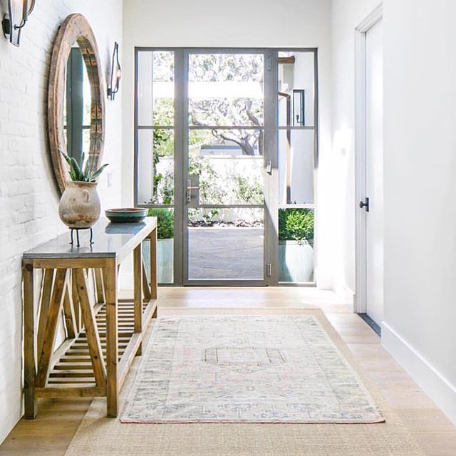 Photo & Design: Kelly Nut Design
Photo: Andrea Kinnear | Design: Megan Molton
From there, I typically take a step back and analyze the collection of inspiration images as a whole. I really get in there and figure out what it is about the photos that embodies the vibe we’re after. I then take that information and translate it into my own version.
In this case, despite the smaller square footage we were working with, I knew the priorities were as much storage we could squeeze in (thank you baskets, drawers, & strategically placed wall hooks), and a casual and welcoming, yet still luxurious feeling vibe. Each inspiration image embodied white walls, a little texture, incredible lighting, and a hint of sparkle, so I made sure to channel a similar aesthetic. In addition to floor plans (of course!) the mood board below doesn’t depict the exact pieces I originally presented to my client, but it is very much along the same lines. We then built the rest of the space, and sourced their *actual* items from from here… 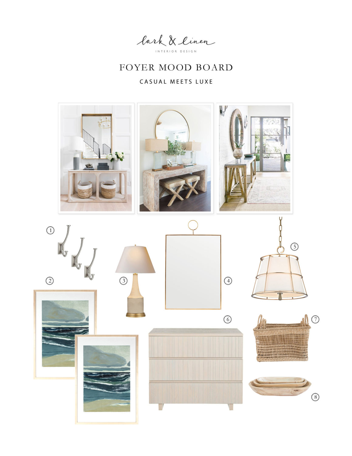
SHOP THE POST:
SOURCES :: 1) Hooks | 2) Art | 3) Lamp | 4) Mirror | 5) Pendant Light | 6) Console Table | 7) Baskets | 8) Wood Bowls
Pretty, right?! It was a wonderful preliminary place to start, and gave us a solid jumping off point for the rest of the designs to organically unfold. Ultimately, this is where we landed, and at the risk of tooting my own horn, I’m pretty sure we nailed it (for all of the final sources in this photo head on over to the full reveal post for this project right here!)
Photo: Will Reid
CHECK OUT THE REST OF THIS PROJECT HERE
filed in /

Love to see your process and a little behind the scenes of your design life. Those mood boards really help to visualize.
I’m so glad, thanks for chiming in Christine!
It’s beyond gorgeous and I love getting to read more about your process! Beautiful as always!
Thank you so much Chloe!
Very innovative work. Great utilization of resources!!