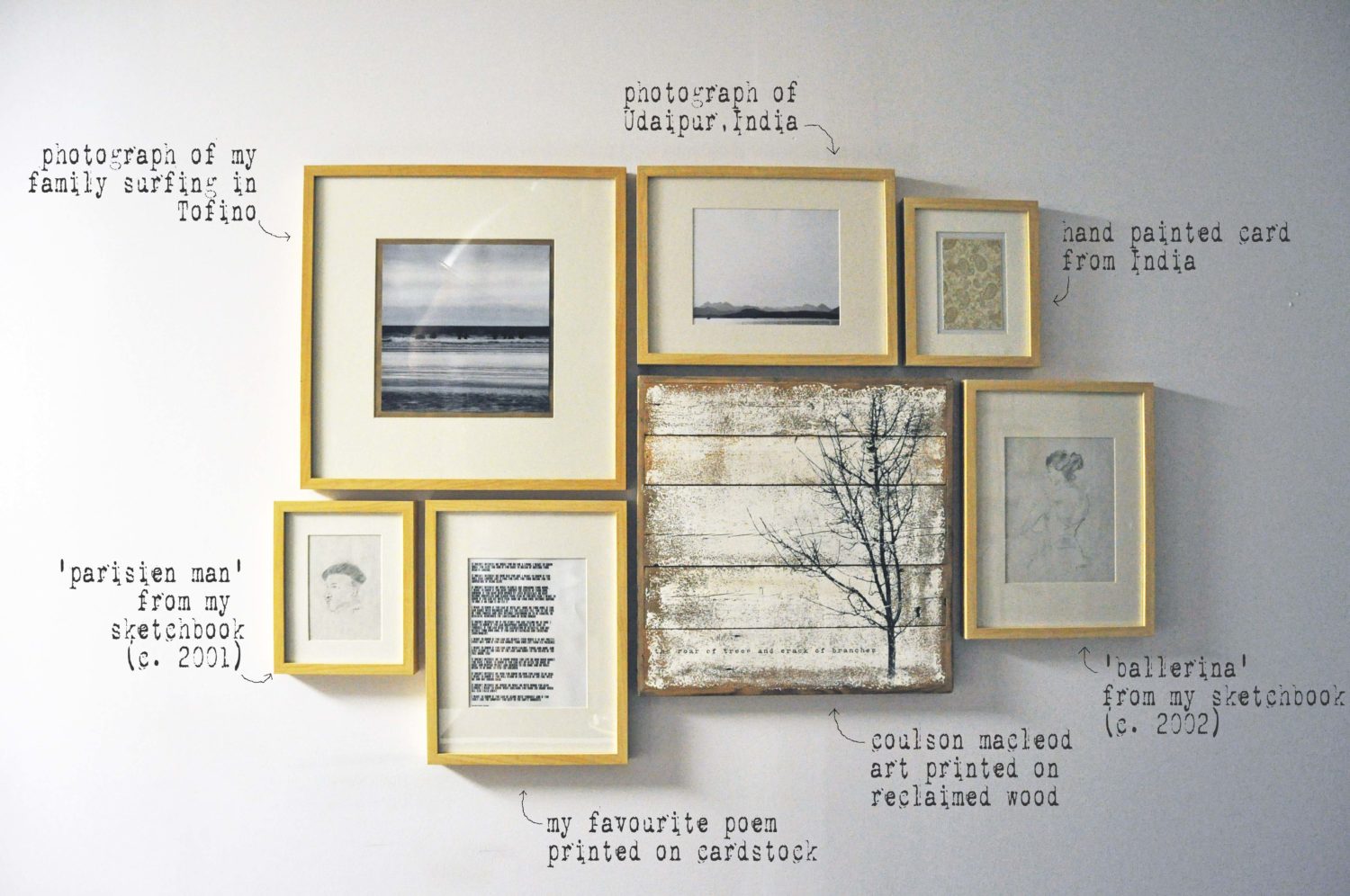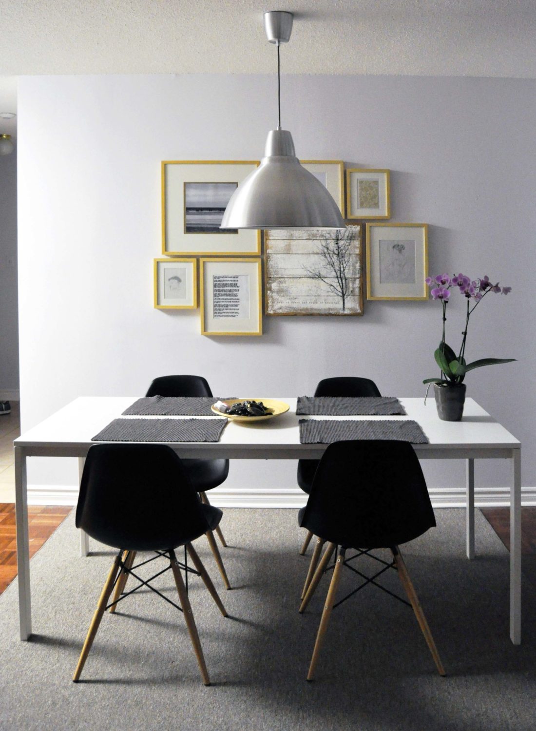
Remember this post of yore? After much contemplation (and some serious voting action from the likes of you – thanks guys!) Justin and I finally got our act together and filled up that sad, blank wall in our dining ‘room’ (I say room lightly as it’s more a dining corner – wahoo condo living!) Since finalizing our decision to go the direction of the art wall, we’ve been collecting items to frame. Seeing as we’re both on a tight budget, we knew that we had to be savvy with our selections. Luckily, I was able to dig through my files (both of the computer and of the old-sketchbooks-in-my-mother’s-basement variety) and found a bunch of personal art and photography that worked quite well together. Take a look below (and click on the image for a larger view) to see where our pieces surfaced from. I’m happy to say that thanks to the $1 printed card I purchased in India and my Coulson Macleod prize from a challenge I entered back in October (here), the wall was virtually free! Oh happy day! I’m so pleased with the results.
and if you’re looking to attempt an art wall of your own, here are a few of my tips:
::At least one element should remain consistent throughout to tie the pieces together as a whole unit. A few examples: use the same frames, stick to a similar colour scheme (all black and white images, all highly saturated images…), use pieces in the same medium (all photographs, all oil paintings…), or stick to a similar theme (landscapes, family photos…). While I believe that one element should be consistent, some of the most interesting art walls I’ve come across mix and match mediums, colours, and/or frames, so don’t be afraid to have a little fun with it.
::The most common mistake made is not hanging art at an appropriate height. The rule of thumb is that the centre of your cluster should be at eye level (ie 5′ off the ground). That isn’t to say that you can’t extend your art wall from floor to ceiling for the most wonderfully dramatic effect.
::Chose a spacing between your photos and keep it consistent. In our case we chose a 1″ gap between each frame.
::Get creative! Tack up an old strip of photos or frame a pretty peacock feather. There are endless possibilities.
::Asymmetry is beautiful, so long as balance is maintained. For example. If I had two or three light and bright pieces on one side, I would balance out the other side with a single heavy, perhaps dramatic piece on the other.
::And lastly, there are no real rules and like most things, to each their own; these are just guidelines that I find helpful when completing a cohesive scheme.
filed in /
